 Branding
 Digital Marketing
 Web & App Dev
 IT Services
How to Make Your Website Friendly for Mobile Commerce

By 2016, 25% of online sales will come from mobile devices. Moreover, 32% of US mobile phone users buy on a weekly basis from websites they access through their phone. These findings and others quoted in a July 2014 article by eMarketer make it clear that retail businesses need websites are that are mobile-friendly for M-Commerce. With mobile transactions representing such a large percentage of online buying, investing in a mobile website is no longer just for scoring SEO points with Google. It’s essential to your eCommerce platform.
At the same time, not all mobile-friendly websites provide the same level of functionality. A dedicated mobile shopping app is expensive to build, but maybe you can get by with responsive design. In fact, one of the first decisions to think through is just how mobile-friendly should you be? Here are your options, starting with the least expensive and easiest to implement.
1) Lighten up your content
30% of mobile web users will abandon a page if it takes more than 6 – 10 seconds to load. A one-second delay in page response can result in a 7% reduction in conversions.
Regardless of which path you take for mobile-friendly, at the very least you should minimize the time it takes for your web pages to render. 4G cellular bandwidth isn’t available in all regions and it doesn’t always deliver the speeds their providers promise. If you sell internationally, 4G bandwidth is even less available and less affordable. Review your website and remove, replace, or resize elements that delay page render time. Large images, animations, videos, and even backgrounds can slow down performance. Go through your code to remove or change inefficient, unused, or unnecessary JavaScript and CSS.
If you improve website performance for your mobile visitors, you’ll also be doing your desktop visitors a favour.
2) Make sure your website functions properly on mobile devices
Just make sure your website doesn’t break on a smaller screen. Most mobile devices zoom and pan to allow users to move around a web page, so while this isn’t delivering a wonderful user experience, it could be sufficient. The most basic tweaks are adjusting font size and viewport size. Here are some examples of devices and screen sizes.
-
< or = 320 pixels: iPhone – 320 x 480 | HTC, LG, Samsung – 320 x 480
-
> 320 pixels: iPhone – 320 x 480 | HTC, LG, Motorola, Samsung – 320 x 480 | HTC, LG, Motorola, Nokia Lumia, Samsung - 480 x 800
-
> 480 pixels: HTC – 540 x 960 | HTC, Motorola, Samsung – 720 x 1280
-
> 768 pixels: Tablet browsers: HTC, LG, Samsung, Motorola, Nokia – 480 x 800 | iPad, iPad mini – 768 x 1024 | Samsung Galaxy Note – 800 x 1280
- > or = 960 pixels: Desktop computers and high-resolution screens
3) Use responsive design
Design your website to provide optimal viewing and navigation across a range of popular devices. Responsive web design takes advantage of browser functionality that automatically checks for screen size, orientation, and other display attributes. Responsive web design uses a grid layout, CSS3 media queries, and fluid images to support a variety of target resolutions and screen sizes. The planning process requires close collaboration between marketing and web development, because navigation and content must take the various layouts into consideration.
You also need to test rigorously to make sure the website behaves properly across all device operating systems and browsers. However, responsive design means you’re maintaining just one website for both desktop and mobile. True, it’s a more complicated website but it’s still less expensive than building and maintaining two websites. (Related article: Why Your Website Isn’t Converting Sales).
4) Build a Dedicated Mobile Website
Studies show that mobile customers are often impulse buyers and will spend more money per purchase than desktop users.
A dedicated mobile website offers an optimized user experience. When you make such a decision, however, you need to do some serious research and planning to determine your priorities and how to implement. Obviously you want to streamline the shopping experience, but what other roles can the mobile website play in your marketing and business strategy? How do mobile visitors interact differently than desktop users? You will need to consider a range of issues from strategic down to the details of performance, navigation design, and how to minimize use of input keys.
Keep in mind that 66% of smartphone and tablet owners who try to purchase online say they’ve abandoned the effort because the checkout process took too long. Other reasons are concerns over credit card security, long forms, and just plain old technical issues. Remember that you want to take advantage of the moment. Reduce friction wherever possible. Simplify searching and buying. Make navigation clear and intuitive so that you guide visitors through a positive buying experience. Make your calls to action (CTAs) obvious. And test, test, test.
5) Build a Mobile App
Unlike the previous options which are browser-based, a mobile application is software that must be installed to run on the mobile device itself. A mobile app takes advantage of specific device features such as camera, touchscreen, buttons, GPS, accelerometer – even other apps that ship with the phone. Since a mobile app lives on the device, it can have features that are usable offline. There are apps for shopping, gaming, personalization, weather, and calculations – the options are limited only by creativity and budget.
Again, you need to consider how you want the mobile app to contribute to your marketing and business strategy. Mobile eCommerce is an obvious reason for building a mobile app, but other common reasons include promotion, customer engagement, and customer service. Or all of the above. Here are a couple of examples of mobile apps that are doing it right by providing a positive experience for the user and monetization opportunities for the retailer.
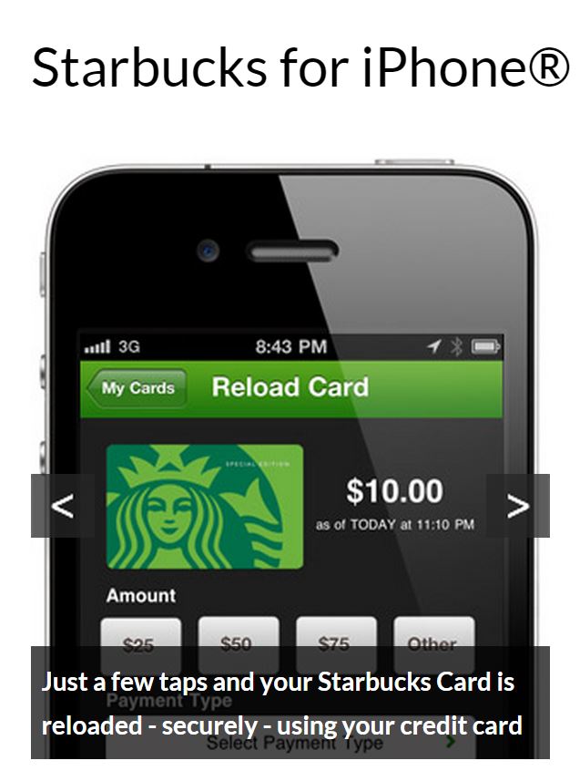
Starbucks: This is like a Starbucks Rewards Card with more benefits. Pay and reload your ‘card’ while collecting digital reward stars to earn free drinks. Starbuck gets to send offers or iTunes downloads to the customer’s Inbox.
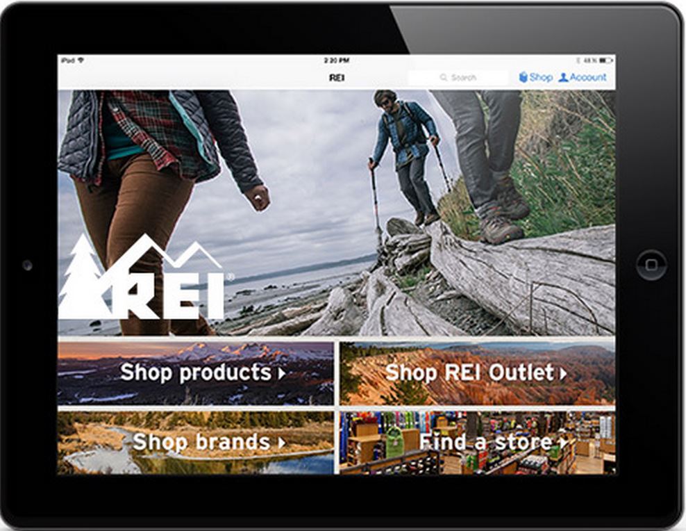
REI: This outdoors company delivers a lot of features to users that streamline the shopping experience. In-store shoppers can use barcode scans to receive product information and customer reviews to their phones, while remote shoppers can check product availability at store locations and have their selections shipped for free to their preferred location.
Apps may download for free, but development and maintenance are expensive. Remember that every device platform is potentially a separate development project. Treat apps as products with a life cycle. You may want to add/enhance features, and you definitely need to stay current with newer versions of mobile operating systems.
6) Measure Your Results
The M-Commerce world is on a learning curve even as mobile technologies become more integrated into everyday life. Monitor your website and transactions to determine how mobile buyer behaviours evolve. It’s good to keep up with industry trends and statistics, but the best stats come from your own users and target audience. Turn on analytics and track your conversion success for purchases, promotions, or just task completions.
If you want to assess whether your website meets today's business requirements, contact us and we can help you perform a website audit.

