 Branding
 Digital Marketing
 Web & App Dev
 IT Services
Part 1 of 2: Mobile-Friendly Web Design - What are Your Options

Our previous blog post, Why Marketing to Mobile Users Matters, provided overwhelming evidence that mobile device users of Smartphones and tablets actively rely on those devices as shopping aids: to find the nearest store, to compare products and prices, and to purchase. Could your business use a boost from making it easier for walk-in traffic to find you? In fact, how mobile-friendly is your business (desktop) website? To find out, see Google’s GoMo site, which shows you what your websites would look like on a mobile device and lets you test the functionality of your website on a mobile device. They also provide a PDF report of the results that includes some good general tips for mobile website design. The first question to ask: to what extent should my website go mobile? There are different ways to make your website easier to read on Smartphones and tablets. Your decision depends on:
Your goals for a mobile website:
A travel business may want to provide full functionality, including self-service cruise bookings, on a mobile interface. Or, just use the mobile interface as a complement to the desktop website by making it easy for the user to press a button on the Smartphone to connect to a travel agent.
How many mobile users come to your site:
Your web analytics can identify the type of browser visitors are using to access your site. In Google Analytics, you can find this information by going to Audience, then selecting the Mobile option. This will show you how many visits came from mobile devices and which kind of device. If a high percentage of visits are from mobile visitors, you may want to make your website more welcoming to small screens. (Read 3 Easy Website Audit Tasks You Can DIY to see how you can perform a website audit yourself.)
Which pages did mobile visitors try to access?
Even if there number of mobile visitors is low, dig deeper. In Google Analytics you can find out by going to Content and then filtering for Mobile via the Advanced Segments option.
This shows you the pages that mobile visitors accessed. There are other ways of slicing the data to determine how long they spent on each page and the flow of the visit. What information do you think those visitors wanted to see? Your store location? Hours of operation? Product prices? A phone number? Job postings? Based on a bit of analysis, do you need to revise your mobile website goals? Back to that first question: to what extent should my website go mobile? In order of difficulty, your options are:
-
Make sure your website presents and functions correctly on mobile devices
This is the least amount of work and you won’t be serving up a desktop experience by any stretch of the imagination, but it could be sufficient for your needs. The most basic tweaks are to adjust for font size and viewport size. Nothing fancy, just prevent stuff from breaking on a small screen.
-
Implement Responsive Design
Also known as “adaptive layout”, this approach makes use of the ability of current browsers to query for screen size, orientation, and more. Your website targets a few specific resolutions and device sizes and “adapts” as the browser determines screen specifications. The example we showed in our last blog post of a site belonging to a web-savvy politician uses this approach. Smashing Magazine is also a good example to check out. This option requires more planning because it’s not just a matter of adjusting for size. You also need to prioritize content and design your adaptive navigation to suit each layout. The good thing is that you are still maintaining only one website for both desktop and mobile. True, it’s a more complicated website but it’s still less costly than your next option.
-
Build a Dedicated Mobile Website
This is a major undertaking that requires research in order to make decisions about strategy, content, and target devices to address, to say nothing of tools and platforms to use for development. A dedicated website will need its own domain and offer a completely different, optimized experience for the mobile user. Performance, navigation, minimal use of input keys – you will need to design for all of these factors. Below is how the IKEA desktop website looks (left) compared to their mobile website (right).
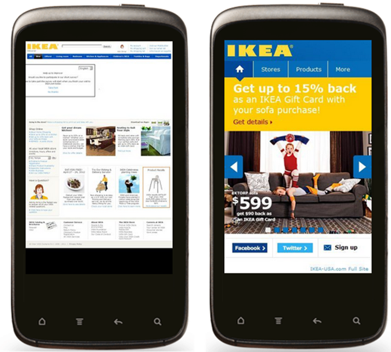
 If you do implement a true mobile website, make sure you provide a well-placed link to it in your business website and vice versa. The IKEA main site has a text link on the upper-right to its mobile site (below).
This is hardly noticeable when viewed on a smaller screen (see above left again). An eye-catching button on the main site would help mobile users get to a more satisfying dedicated mobile web experience. A mobile website can also be adaptive.
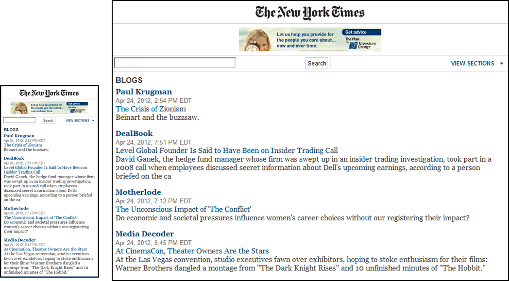 The New York Times mobile interface is an example of a website that recognizes readers could be perusing headlines on a Smartphone or on an iPad while commuting in to work.
 -
Build a Mobile App
All the previous options are browser-based applications where functionality and content reside on the website’s server; the mobile device must connect to the server in order to have any sort of functionality or content. They need to be compatible with the different browsers used by various mobile phones. A mobile app is software that runs on a mobile device’s operating system and makes use of the specific features of the phone (think buttons and touchscreen, GPS, accelerometer, camera, other apps that ship with the phone). A mobile app lives on the device, so there can be features that are usable offline. Apps for gaming, personalization, calculations, or other functions that need direct access to the device’s resources, are best implemented as a native mobile app. While a dedicated website needs to maintain compatibility with different browser platforms, a mobile app needs to support each mobile device natively. Each device you decide to target represents a different platform that is potentially a separate project, not to mention ongoing maintenance to ensure compatibility with newer versions of operating system, firmware, and any other resources used by the app. Finally, remember that before you can sell apps through an app store, you must get approval from the device manufacturer. Manufacturers receive a percentage of every app sold, so there are lots of tools and forums out there to help you ensure compatibility and a smooth approval process.
Part 2 of this series will give you some of the essentials of designing for mobile devices. But as you can see, one of the first decisions you need to make is how mobile-friendly do you need to be? The good news is that with some planning, you can take incremental steps. Start with the first option (tweaking your website to present properly on mobile devices) and move to the second option (responsive design). If your business goals warrant it, take the plunge and move to a dedicated mobile website or a mobile app.

