 Branding
 Digital Marketing
 Web & App Dev
 IT Services
5 Tips for Clickable Flat-Design Websites
If you talk to a web designer these days, you’ll probably hear the term ‘flat design’. This current trend in web design strips out 3D effects such as shadows and gradients in favor of clean, strong colors and purposeful use of typography. Microsoft’s Windows 8 Metro interface is a prime example of flat design, meant to be as functional on traditional desktops as on touch screens or mobile devices. iOS and Android have also adopted more minimalistic flat designs for their interfaces, making this approach a serious contender for website refresh projects.
One complaint about flat design is that some websites have become less clickable, therefore, less effective at conversion. Over time, users will transition to new visual cues that signify action, but meanwhile, chances are your customers are still looking for blue hypertext and rectangular buttons.
Never give up conversion for the sake of style. Make sure your users can tell at a glance what’s a button or a clickable link. Here are 5 things to watch for when talking with web designers to ensure you can achieve both clickability and a stylish website.
1. Retain the physical look of buttons
In a classic 1995 study, rounded buttons increased clickability by 416% over flat buttons. The difference is probably not as dramatic now, 20 years later, but dimensionality is still one of the strongest visual cues that something is clickable. In flat design, 3D does not exist; therefore designers need to create recognition in other ways. Retain the rectangular look of a button.

2. Avoid making non-clickable elements look like they're clickable
Conversely, avoid putting a rectangle around text, especially short text. It could make them look like buttons. With flat design, it’s easy to do this inadvertently. In the design below, the main menu consists of a row of buttons across the top which are simply text within boxes. The text in the black box that reads ‘Articles from all Locations’ isn’t clickable but looks as though it should be, since it’s the same shape, font, and color scheme (in reverse) as the menu buttons. This gives the impression that you should click to see more, instead of scrolling down.
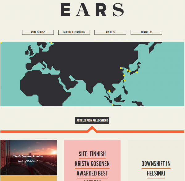
Source: ears.asia
3. Use recognizable icons
Minimalist is the mantra, and flat design employs more streamlined versions of familiar icons. When selecting an icon set, be sure to pick designs that are easy to recognize. Some icons are fairly standard, but other interpretations might be ambiguous. If you have any doubts at all, combine the icon with a text label.
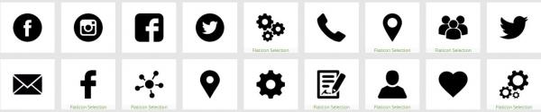
Source: Flaticon.com
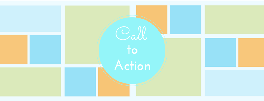
4. Support content hierarchy
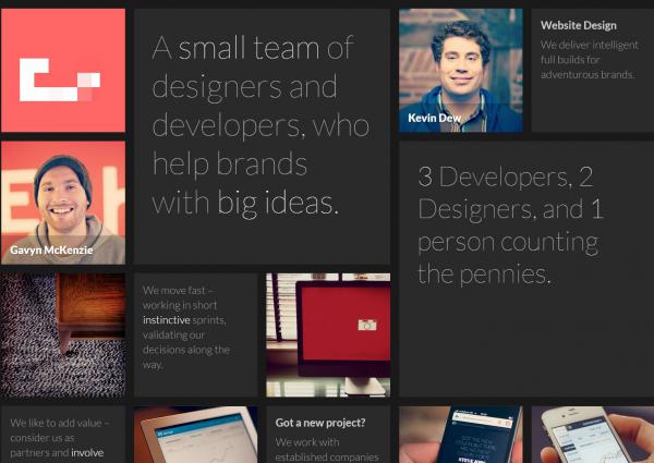
Since Windows 8, tiles have become a popular design element. Whether or not the squares on a mosaic page are clickable, it’s important that the size, placement, and prominence of your tiles guide the visitor through the content flow and to a call-to-action. In this great example below, the banner makes the purpose of this page clear. Smaller tiles link to topics, each with an eye-catching graphic as well as the topic title. It is essentially a flat hierarchy of information, arranged by category.
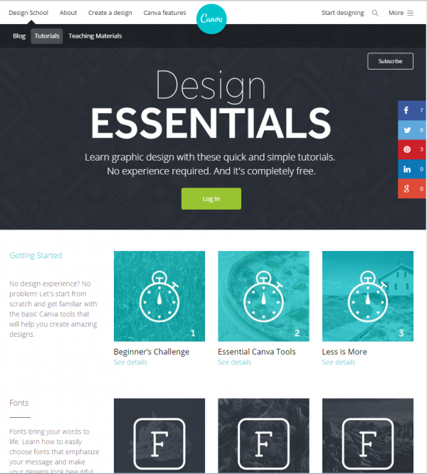
Source: canva.com
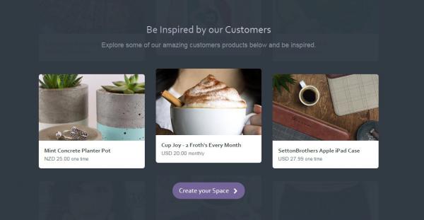
In the example below, user experience is a mixed bag. Tiles with text and images click through to a sub-page. Image-only tiles move up to reveal a few lines of text. Text-only tiles are not clickable. There is no prioritization of topics (staff bio, portfolio example, Who We Are) and in fact, each time you return to this page the tiles have rearranged so that you’ve lost visual reference. Visitors would find this either annoying or feel intrigued enough to explore.
Source: etchapps.com
5. Increase the target size
This one is related to the use of tiles. Tiles in a mosaic design can incorporate a combination of elements: text, icons, buttons, or images. If there is a clickable item within a tile, make the whole tile clickable. When you increase the target size you increase the probability of capturing a click, especially on mobile devices.
Source: gospaces.com
Flat design lends a clean, modern look that’s well-suited for mobile-friendly sites. While it brings a minimalist appeal to any website, the key to success is to avoid the temptation of going too minimalist. Make sure you provide enough visual cues to guide visitors through your content and ultimately, to the desired call-to-action.
We’ve become an impatient society of Internet browsers. Statistics say you only have 7 seconds to capture a website visitor’s attention, so when you plan your website refresh, make sure it does more than just look beautiful. Make sure it converts. If you have any questions about how Smartt works with clients to achieve these goals, contact us.

