 Branding
 Digital Marketing
 Web & App Dev
 IT Services
CTA Design: Go Beyond the Button
Marketing departments run campaigns that focus on getting qualified traffic to their websites. They follow up with good content to engage the visitor and social media to keeps the contact and conversation going. But what about the call-to-action? Is it clear to your audience what you want them to do as a next step?
A digital marketing campaign can be a major investment. Whether you’re a B2B company trying to connect with new sales leads, a B2C company running an eCommerce site, or a non-profit, the end goal is to get a conversion – so put some extra effort into designing the best possible call-to-action (CTA). Fortunately, this is fairly easy and inexpensive.
The Entire Page IS the CTA
Every website is different and each ‘offer’ is different, but some essential principles always hold true. The biggest one is: think of the entire page as a CTA, not just the button. Everything on the page needs to guide the visitor to the final step: clicking on the CTA button.
It helps if you can provide your designer and copywriter with clear directions on the following:
-
Why is the visitor here?
Why are they on this landing page? How did they get here? If they got here because of an email campaign, chances are the email provided enough information that the visitor expects to land on a page where they can take action – donate, sign up, or enter a contest. Keep the page content brief, make the CTA simple and obvious.
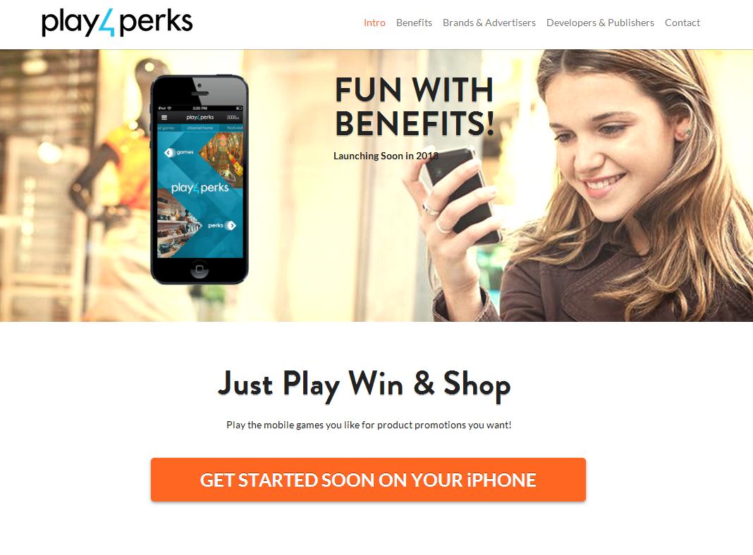
This is a simple message from play4perks with a simple CTA
On the other hand, if they arrived via a display ad about a new product, you must assume this is the first time they’ve heard about the product and they’re here to learn more. Since a display ad contains just a few words – not a lot of information -- your landing page will need to deliver more.
If the information is not enough to allow the visitor to make a decision, it’s better to have a CTA that clicks to another page than to have a text-heavy landing page. You may need more than one CTA: to download a trial for example, or link to a contact form for a follow up call.
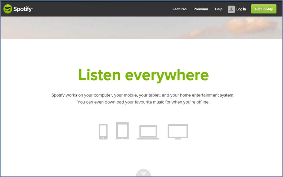
This Spotify page engages with a down arrow that is the only CTA. It’s at the bottom of a series of pages that explains their service.
-
What is the page’s goal?
Most landing pages are designed to get visitors to Buy Now, or to generate leads. Others promote brand awareness or educate. If the goal is for visitors to read important content first before moving on to the CTA, keep the CTA low-key to avoid distraction while reading.
If you’re trying to get visitors to sign up for a free trial, the copy needs to be reassuring and enticing, but the CTA also needs remind them that this is a low-risk/no-risk proposition.
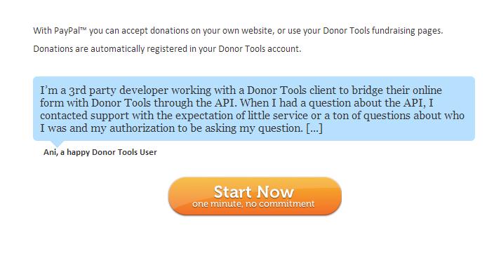
The CTA for Donor Tools, a fundraising management solution is a great example of giving the visitor reassurance about time and risk: one minute, no committment.
-
How complex is the offer?
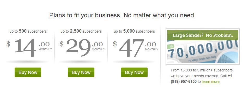
If you have a straightforward offer that’s low-risk, keep the page simple and the CTA highly visible. Many B2B offers are more complex: different pricing plans, or primary (preferred) and secondary offers. In these situations, the copy needs to work harder and position each of the offers. Why would a visitor pick one pricing plan over another? What would motivate a visitor to click on the primary offer to Download Now instead of the secondary offer to View the Demo?
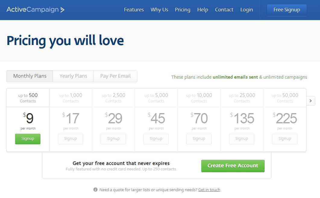
These CTAs make each offer very transparent to the visitor what to expect. ActiveCampaign uses green to highlight the ‘starter’ offer, the fact that the plans include unlimited emails and campaigns, and as a final incentive – the free offer.
Guide the Eye
Good CTA design guides the eye to content, in the right order, and eventually to the CTA button. A well-designed landing page employs a balance of graphical elements and text to move the visitor along. Consider the copy and overall design of your landing page and determine whether any of the following tips can improve your visual guidance.
- White space
White space defines blocks of text. White space de-clutters. White space allows your button to stand out. White space is mobile-friendly – on a small screen, text and links that are too close together can be frustrating.
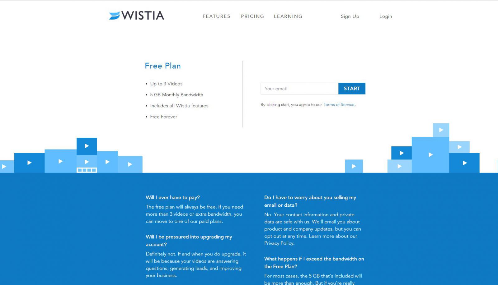
Wistia uses white space to define the CTA area from the information area.
- Left to right
English language users are accustomed to reading from left to right, and for CTAs to appear on the right once they’ve finished reading the offer.
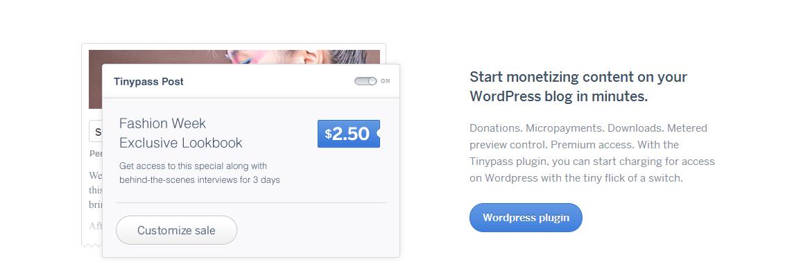
This Tinypass CTA area is clean, easy on the eyes, and the CTA button stands out elegantly. It also places the CTA button to the lower right, where the visitor expects to see it after reading the text.
- Front and centre
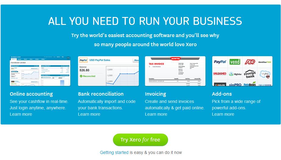
Having said that, if there is only one CTA button and the design supports it, a centre placement such as this one from Xero can be dramatic.
- Contrast
Usually this means colour – a bright blue button that stands out from an otherwise red colour scheme.

This high-contrast example from Wufoo is fun and effective.
But this can also mean a contrast in design – a shape that’s designed to contain a button and a few lines of copy, so that the CTA is in a distinct area of its own.
This iContact CTA area is designed to ensure that high-value customers know the company can provide pricing and support for large account.
- Messaging emphasis
CTA buttons can be very effective if you reinforce the landing page’s message. Include a bit more text inside or around the CTA that reassures or motivates the visitor. Instead of Buy Now or Download, repeat a message so that it’s 100% clear you will meet their expectations. Sign up for a FREE trial (‘free’ is always a good word to emphasize). Sign in and start organizing files within minutes. Get a no-obligation quote. Subscribe now and get your first month free.
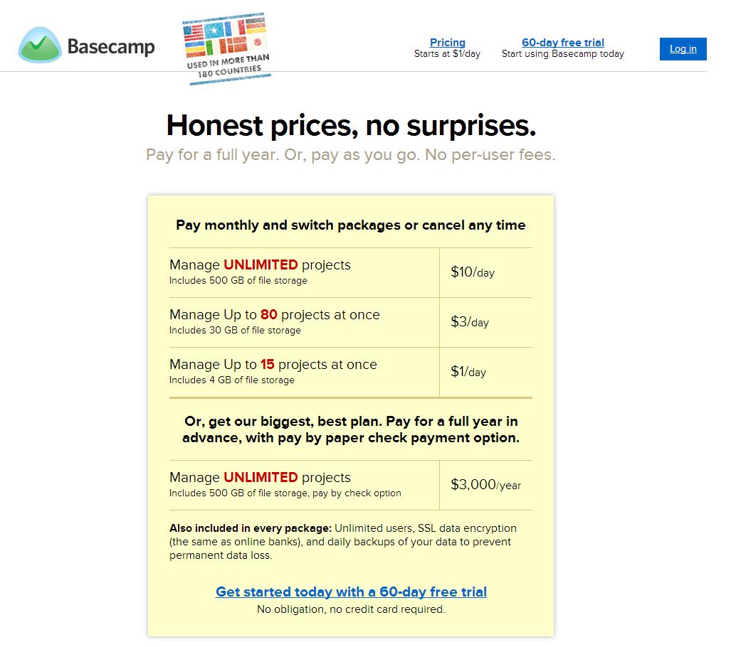
This Basecamp sign up CTA repeats the “No obligation, no credit card required” reassurance found on other pages of the website
- Prioritize with design
When you have two or more offers, the design needs to present them in order of priority. Which action do you want to encourage the most? If you want to arrange multiple CTAs horizontally, keep in mind the left to right rule – arrange the primary CTA leftmost and the rest in descending order. If you stack, place the primary CTA at the top. If you use colour, give the primary CTA the highest contrast treatment.
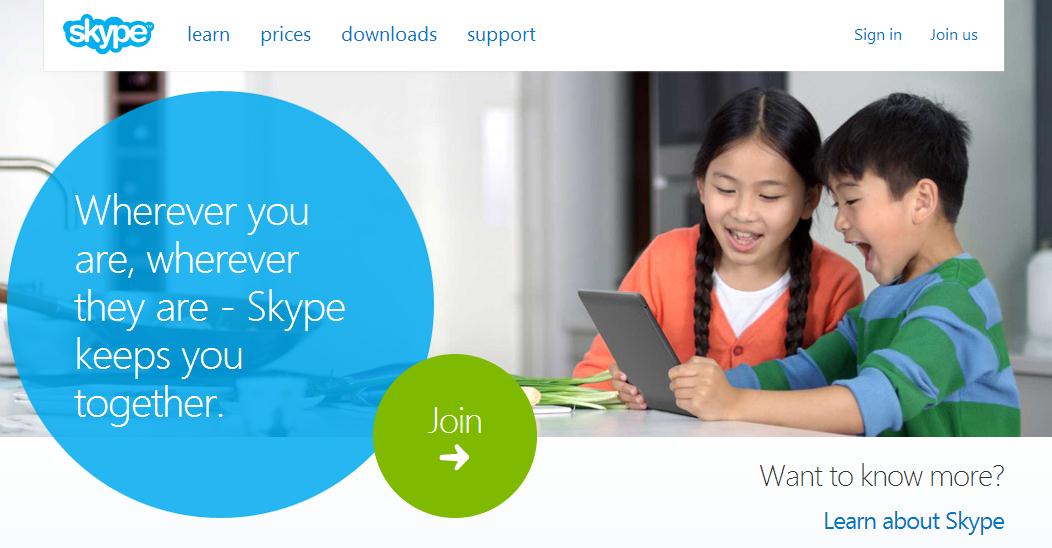
Skype’s CTAs consist of a simple and visible ‘Join’ button for those who have made up their minds, and a secondary CTA to “Learn about Skype”.
Keep your landing page as simple as possible. Too many CTAs get confusing, no matter how well you design the landing page.
- Test, Test, Test
How can you tell whether your landing page and CTAs work? You can’t rely on gut-feel. Your target audience may not share your preferences.
- Google Content Experiments is free and integrated with Google Analytics.
- Optimizely starts at $17 per month to track results for 2,000 visitors per month.
- Visual Website Optimizer offers a 30-day free trial, and charges $49 per month to track up to 10,000 visitors per month.
You must test. Use A/B tests to validate or refute hunches. Even your CEO won’t argue against objective statistics!
If you need help with website development, web design, website roadmap planning, or other web services, please contact us and complimentary meeting with one of our digital marketing consultants.

