 Branding
 Digital Marketing
 Web & App Dev
 IT Services
How Well Does Your Homepage Convert?
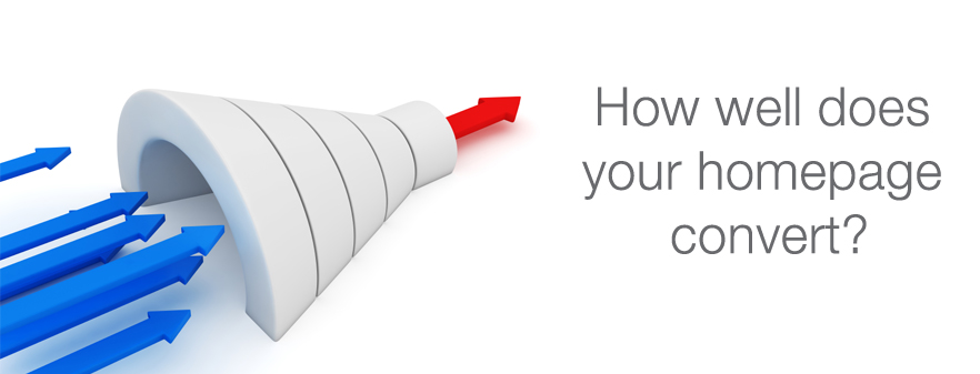
Your homepage is the first encounter many customers have with your business. How important is it to make a good first impression?
75% of web users admit to making judgments about the credibility of an organization based on the design of its website.
Stanford University, 2003
An effective home page is the first step to conversion. Take this quick audit of your home page to determine whether you could improve your home page’s effectiveness:
(Note: Smartt's expert team can help you review your website and give you a list of actionable recommendations you can take to your designer. For more information on our website audits, please check our our web design and development services page.)
-
Does your homepage have a clear goal?
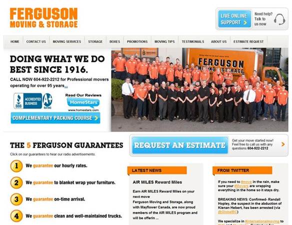
The overall goal of your website is to sell your product or service, but the goal of your homepage might be to entice clients to enter the site. The home page needs to give the user a reason to continue. It is the gateway to the rest of your website. Before looking at anything else, what is the goal of your home page? A designer must be intimately familiar with your goals in order to create an effective design. Your content and design should combine to support that goal. For example, if you provide a moving service for companies, your home page goal could be “to get a business owner to call for an estimate”. If so, you need to provide on the page that allows a customer to make the decision to call you or at least explore your site. You might want to list the other services you provide which make you a one-stop shop for moving such as: warehousing and storage, rentals, office moves, or employee relocation? In the example below, the home page provides not one, but two, incentives to get in touch: Live Online Support and Request an Estimate.
If you are a custom home design firm, perhaps your goal is “to attract clients who share our design sensibilities” because you want to establish a reputation for modernist home projects. Therefore, your home page needs less information, but the design should be clean, minimalist, and reflect a modernist aesthetic while showcasing some of your projects. It’s unlikely anyone will buy a home right off the website, so a call-to-action would encourage clients to call you up and start a dialogue. (See also Does your website need a renovation?)
68% of U.S. online shoppers agree that they will distrust a site that doesn’t have a professional appearance.
eMarketer, 2006 -
Can users find what they expect to find?
There are some basic components that should be instantly identifiable and easy to find. Users need assurance that they will be able to find their way around the site. Think about where you would expect to find elements such as:
- Your logo and tag line
- Navigation menus
- Contact information
- Site search
-
Is there a reason for every design element on your homepage?
Minimize clutter and make it easy for users to discern the goal of your homepage. Widgets, fancy navigation, or animated images may be eye-catching, but unless they contribute to the overall functionality of the homepage and its goal, all they do is distract. Distraction makes it harder for users to find what they need, whether it’s information or navigation. (Read Why Responsive Web Design will matter to Retailers this Christmas Season to learn more about web user-experience.)
-
Does your homepage layout prioritize important content?
Not all content on a homepage is created equal. One way a good design can prioritize content is through layout – the position of text or design elements. If you had to prioritize the content on your home page, what would that hierarchy look like? Now look at where that content is positioned on your page. Studies have shown that we scan content according to an F-shape. Our eyes begin at the top left of a page, then to the right, then down. Are the most important messages on your website laid out to take advantage of the F-shape?
-
Do you highlight important content?
Point 4 explains how content can be prioritized through correct positioning on a page. But within each area of a page, you may want to highlight specific content – which can be text or graphical elements. To make important elements really pop out, you can employ numerous tactics:
83% of businesses use the Internet to research and find potential vendors.
Business to Business Survey 2007 Enquiro - Whitespace: isolates the content or graphical element to make it stand out more
- Size: a larger image or font will cue the user that this information matters more
- Contrast: a contrasting colour or font differentiates an element from its surroundings. There is a reason why BUY NOW buttons are always high contrast. (See Also: Why Your Website Isn’t Converting Sales)
-
Does important information look like an ad?

We are so inundated with online ads that our brains now filter out content that displays like ads, no matter how important the information. If there are important messages or call-to-actions, avoid design elements or positioning that could make them look like ads. In a now-classic experiment, users were asked to find the population of the USA from the US Census Bureau website. Even though this information was located prominently in big red fonts on the top right of the page, only 14% of visitors read and found the information.
-
Page response times matter
A 2006 study by Akamai and JupiterResearch identified the '4 Second Threshold’ as the average amount of time that an online shopper is willing to wait for a web page to render. It is now 2011. Computers are faster, networks are faster, and consumers are even more demanding when it comes to page response time. The homepage is the first contact customers have with your company. A fast-loading clean, crisp design will do more for your brand than a slow, content-heavy page. Go back to Point 3 - clutter. Clutter not only deters due to visual confusion, it can slow down page performance.

